Monthly Archives: July 2013
Powerful New Colors
I want to comment on some new watercolors that I received in the mail. From the offset I want to make it clear that I have no monetary interest in promoting these colors. However, in view of the fact that I have taught watercolor for more than a quarter of a century, I owe it to my students. I want to thank Ms. Kelly Clawson, Brand Manager at Martin/F Weber Company for sending me these goodies. I was asked for comments. I think it is worth sharing with all of you. So here goes.
The brand is called Mission Gold by Mijello. If you Google the product you will see it listed at Cheap Joe’s and Dick Blick as well. No doubt other suppliers have them too. The package I received contains a few colors I don’t normally use. In fact, if I merely relied upon names, past experience with other brands would lead me to avoid the use of some of the paints. However, if you are going to try a product; you really ought to give every offering a fair shake.
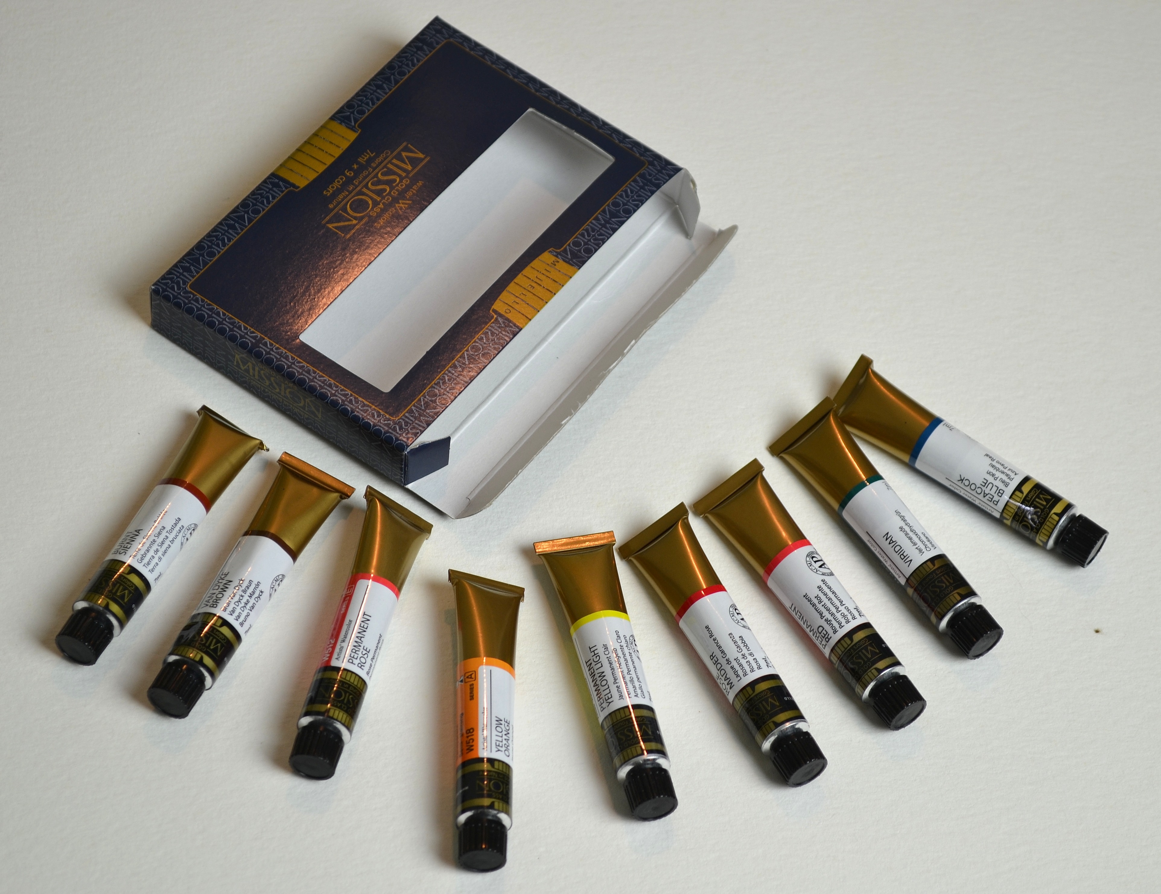 Nine colors in sample
First things first:
My first test was to use the colors full strength over a black India ink field. I prefer to use circles because they conform very easily to a book format. Circles can be tedious so if you want to duplicate my efforts any black line or bar on watercolor paper will do. I would suggest that you use waterproof black India ink for this test. Other paints such as acrylics may pose an absorption problem. My desire is to use the paint under the same conditions that I test all new paints I use. To do otherwise would devalue the results of the test.
Why a black field?
Beginning students will often ask me why I use a black field to test paint. In order to excel with watercolor you really need to know the relative transparency/opacity of your colors. Simple tests like this will tell you volumes. Full strength washes will give you a good idea of the nature of the paint. It will be obvious to those of you who utilize this test that some paints will be fairly opaque at full strength yet surprisingly transparent as you dilute them into washes. The only way you are going to know this is by working with your colors.
First Test:


Starting with the first red, Permanent Rose, I’ll name the other colors as we work around the circle. You will note that I used a clean enameled butcher’s tray for my paints. The order of colors is as follows: Permanent Rose, Permanent Red, Rose Madder, Permanent Yellow Light, Viridian, Burnt Sienna, Van Dyke Brown, Peacock Blue, Yellow Orange.
Checkout the circle:
The circle was painted on a sheet of 140lb. Lana Aquarelle cold press paper. For those who follow me or my books regarding the glazing technique you should note that some of these colors would be on my caution list. The reason is that in some brands, colors like Permanent Yellow and Yellow Orange would tend to be on the opaque side and thereby not a good choice for beginning layers of a glazing technique. If you look at the chart you will see that while there is some degree of film with these two colors and with Permanent Red; there is not as much as I have seen with other paints. Well, perhaps the Permanent Red is a bit opaque. That doesn’t mean that I would necessarily jump right in and use those colors right off the bat as beginning washes. However, take a look at the next series and lets see what happens.
Watercolor Exercise beginning wet into wet:
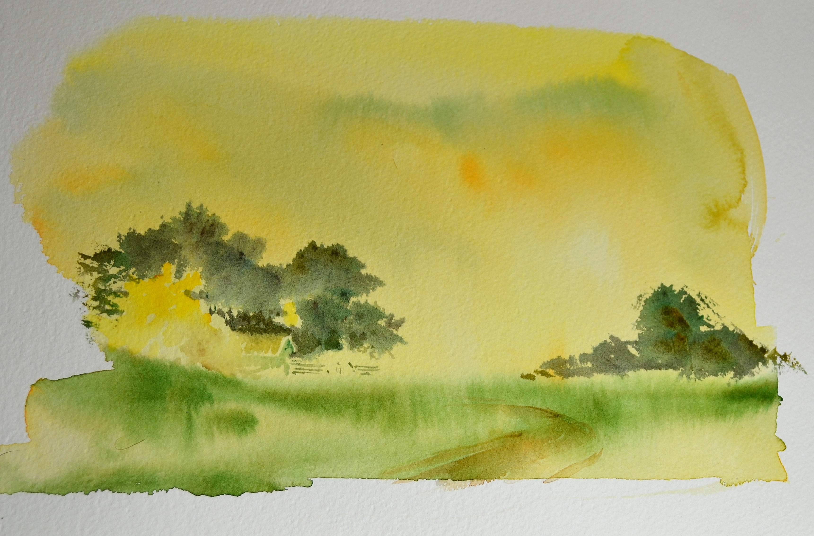
 This sheet is Lana Aquarelle 300 lb. cold press. The image size is approximately 9″ x 12″ (30.48 x 22.86 cm)
In this first pass I wet the sheet with clean cold water. I introduced Permanent Yellow Light with a 3″ flat brush and let it run down the sheet. I was immediately impressed with the strength of the wash and its ability to hold color while diluted. Into the sky I brushed a small portion of Yellow Orange and a bit of Peacock Blue. For years I have avoided paints with catchy names like periwinkle blue, etc. These names often suggest less than serious color. Not so with this blue . While the sky was settling I brushed in Viridian in the foreground. The photo was taken while the paper was still wet. If you look carefully at the bottom of the wash you can see the puddle. I wanted to capture the intensity of the wet color. All of us are familiar with colors “drying back”, that is, losing a bit of their intensity as they dry. Please keep your eyes on the intensity as you view the next few frames. By the way ALL frames were shot in my studio as they were produced. No shots have been manipulated.
 Round two:
The paper is still wet and a lovely misty quality is revealing itself. None of the first wash has been manipulated; it is drying unmolested. The only new color to be introduced is in the tree line. The paper is still rather damp. The tree line is a combination of Viridian, Van Dyke Brown, and Peacock Blue I used the side of a flat brush and took care to keep the fresh wash from mingling with the green pasture. I also left a spot for an outbuilding or two that will emerge later.
 Round three:
The paper is still a bit moist. I added the hint of a road with a bit of Burnt Sienna and used a small brush to work around the buildings. Note how the dark treeline accentuates the yellow of the tree. This is one of those happy accidents if you will. If you like misty watercolors this could be a good stopping place. Start to finish I would estimate that perhaps 25 minutes had elapsed allowing for some drying time. The color is still holding well.
Evaluation:
The color speaks for itself and I could have just stopped here and concluded that I had proven the worth of the paint. Its good stuff. One of the most intriguing things for me was the fact the the color holds its intensity even as you dilute it as a wash. After I did my work I Googled the product and found a factory presentation that consists of running a wash from a full strength dab of the color. Very interesting.
 Later:
I just couldn’t leave well enough alone. Later in the afternoon I looked at the completely dry sketch and wondered what would happen if I glazed some new color over the tree areas and in the immediate foreground. So I got a small brush for spots of detail in the barns and fence area. I mixed up Peacock Blue and Viridian and washed over the greys of the trees. I also introduced some Rose Madder into the landscape in several areas to provide a little balance. The results of the simple glaze was striking. I really didn’t know what to expect because as a general rule the results would have been a bit muddy without additional glazing washes of the same color. As a result a little bit of almost all of the color samples found their way into this little watercolor. It may never hang in the Louvre but it gave me a great deal of encouragement for this new paint. One last thought the grey in the immediate foreground was bit of Rose Madder and Peacock Blue
Bottom Line:
I will be purchasing a number of the colors that are not in the sample pack. I can’t wait to use them in a major piece I am developing right now. I think the color results will be outstanding.
For more information about Don’s revised edition of Mastering Glazing Techniques in Watercolor, Volume I visit:
